

This week in charts #28
This week in charts #28
CPI Spikes. USD hits 20 year high. The end of "play to earn"?

If a picture is worth a thousand words, then perhaps a chart is a worth two thousand?
Here’s the most significant and interesting charts I could find over the past week.
If you enjoyed this post, please hit like and share.
CRYPTO
Axie Infinity Revenue Plummets
Revenue for the blockchain-based game, Axie Infinity, has plummeted. Does this signal the end of “play to earn”?
Crypto games to date have looked comparatively shallow and antiquated compared to their mainstream counterparts. Perhaps it’s unsurprising that when the financial incentives dry up, so do users.
The key test for the play to earn category will be whether games can be made engaging enough to weather bear markets.

MACRO
Exceeding expectations
Inflation hit a whopping 9.1%, exceeding everyone’s expectations and not in a good way.

USD goes parabolic
The DXY index measures the US dollar against a basket of other currencies.
As investors take flight to the safety of the worlds (current) global reserve currency, the index has gone parabolic:

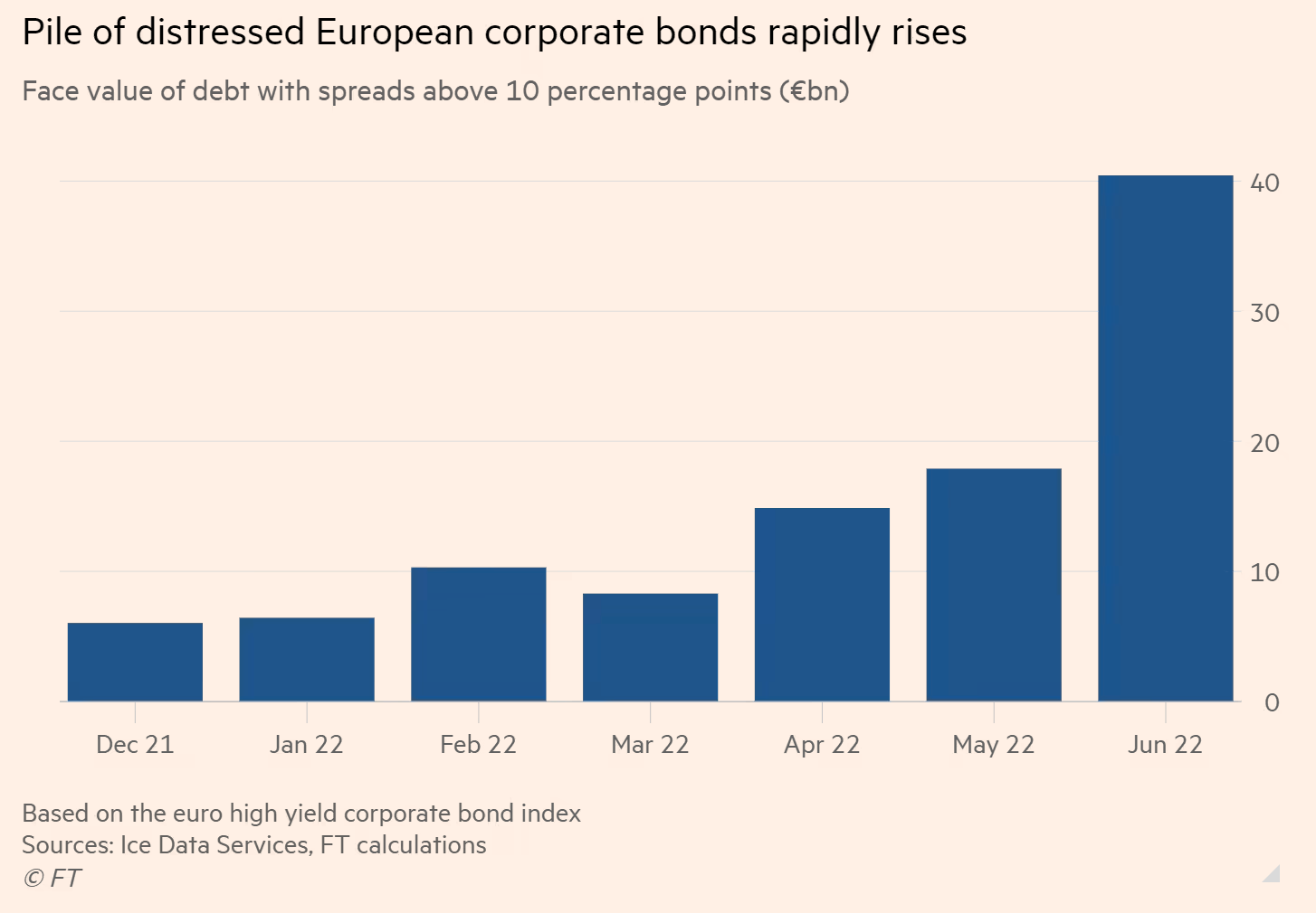
Bad news for junk bonds in Europe
Bond investors in Europe are starting to get concerned that they may not get their money back, pushing up yields. Historically, this kind of rise has been associated with an oncoming recession.
If you enjoyed this post, please hit like and share.
Thanks for reading,
James